ABOUT BUDDHA BOWL TO GO
Buddha Bowls To Go is a family owned restaurant company based out of Austin, Texas. They provide four locations in the downtown and inner areas of the city in which guests can eat-in, order take out or pick-up online deliveries for healthy customizable buddha bowls. They are passionate about creating food that is fresh and delicious and serves as a great healthy option for busy people on the go. Just because people are busy doesn’t mean they should sacrifice the option to have high quality, nutrient dense meals.
Problem Statement
Buddha Bowl To Go’s customer satisfaction has decreased 22% since 2018. Surveys show that the customer’s biggest pain points are long wait times and a feeling of being overcrowded in Buddha Bowl restaurants. Poor usability on their mobile app inhibits user from having the tools they need to easily order customized buddha bowls and pick them up on the go.
Vision Statement
The redesign of the Buddha Bowl To Go app will provide users a more effortless ordering experience by allowing them to quickly customize their buddha bowls that meet their needs so they can easily grab and go once they enter the store. This will also help reduce long wait times for those customers that choose to order in the store and dramatically improve overall customer satisfaction and lead to increased annual sales.
The Process
I started with a project brief that detailed the project description and problem I was trying to solve. Within this project brief I outlined the target audience, provided an analysis of their existing app as well as a comparative analysis of a competitor’s app. I made general assumptions for the existing app as well as suggestions for process improvements and basic core functional requirements that needed to be included in the redesigned app. After defining the core needs of the app I then created a sitemap of the app’s content and architecture, low-fidelity wireframes mapped out on a user flow and then iterated on the design based on user and stakeholder feedback until I was able to provide them with a high fidelity interactive prototype of the app.
Target Audience
It is important to understand the target audience and their experience since they are the people who would be using the Buddha Bowl To Go app in order to provide knowledgeable recommendations for their redesign. I identified the target audience for this effort as follows:
Demographics:
Ages: 18-55
Gender: Male or Female
Marital Status: Single, Married, Divorced or Widowed
Education Level: High School or Above
Income: $30,000+
People that live in the downtown or inner-city area of Austin, Texas
Working professionals that are busy or on the go often
Behaviors:
Used an online ordering system before
Prefers to eat out at least 2-3 times a week
Technology Use and Experience:
Uses the internet at least two hours a day
Has gone online and used a food delivery or online ordering service in past 6 months
Familiar with apps that have food delivery or online ordering services
Analysis of Existing App / Comparative Analysis
After I outlined who the target audience was, I conducted an analysis of the existing app in order to establish a baseline for what was and wasn’t working within the app. Throughout this process I was able to identify key opportunities within the existing app that I focused on as a starting point. I then assessed what parts of the app were critical for the user to have in order to complete their tasks. Starting with those core capabilities as a base point, I created a sitemap for the app in which I was able define the overall content and organization of the app and what basic functionalities the app would possess in order to provide the user with a minimal viable product.
App Sitemap
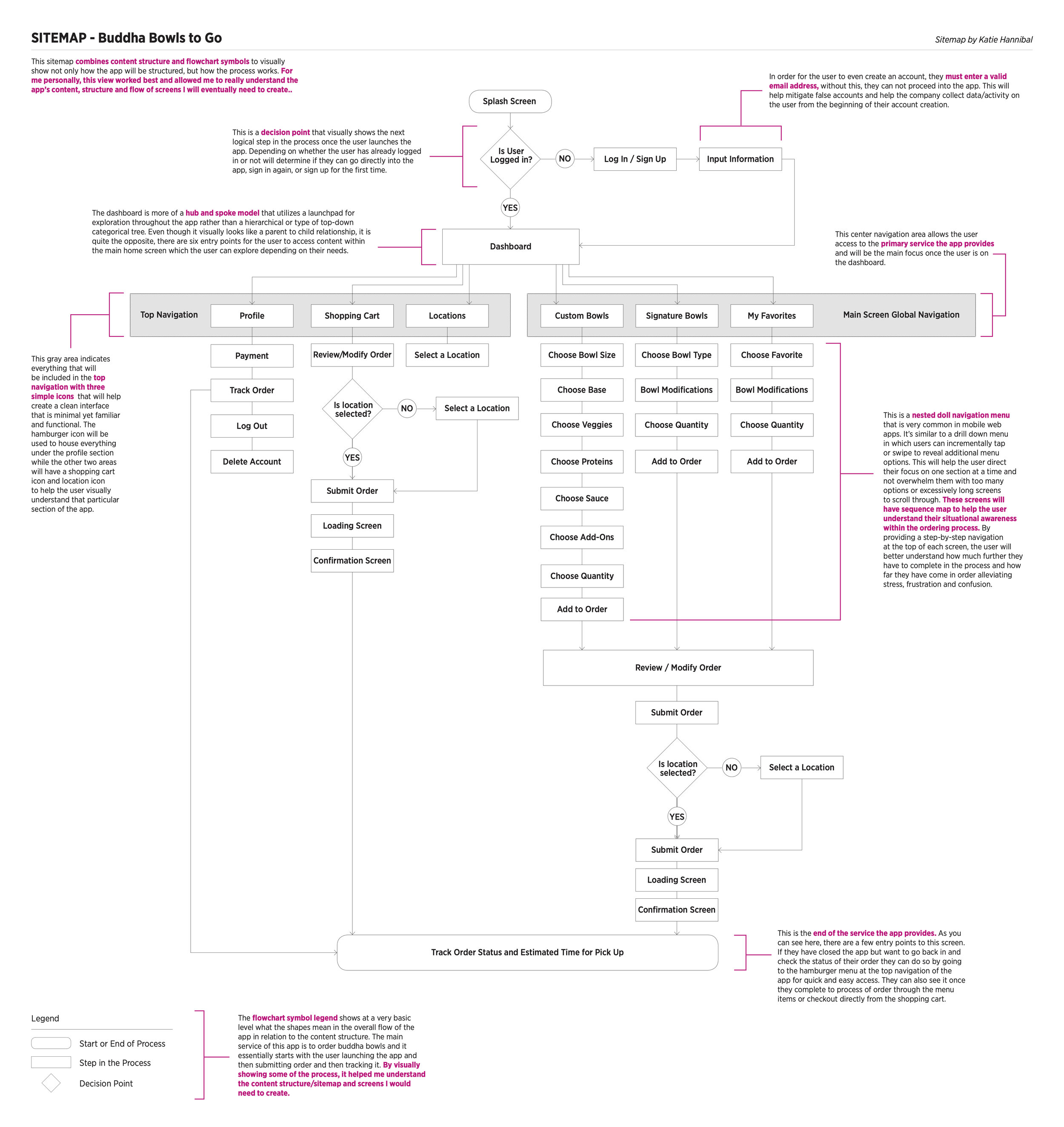
This sitemap combines content structure and flowchart symbols to visually show not only how the app will be structured, but how the process works. For me personally, this view worked best and allowed me to really understand the app’s content, structure and flow of screens I was eventually going to create.
Wireframes
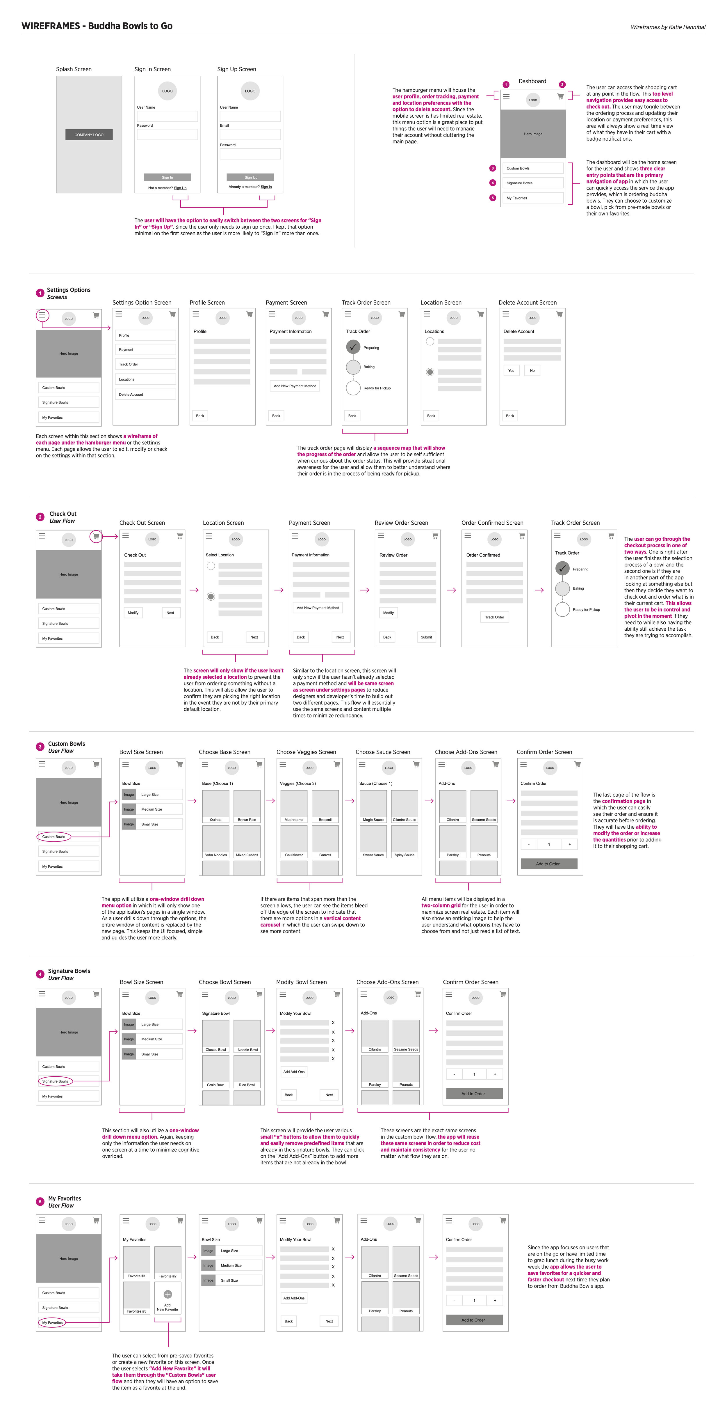
Once I defined the overall architecture of the app, I was then able to easily flow into the next phase of the project effort, which was understanding what content would be on what screens and how the user would flow through those screens. For me, the best solution was to create low fidelity wireframes laid out in a way that also showcased the user flow. Wireframes were a great way to quickly create, test and iterate on my design prior to building out the more formal UI components. By understanding the bigger picture of the app up front, I was able to pivot and shift my design accordingly prior to any real heavy design work was done. This allowed me quickly flex my designs and ideas without spending too much time on the the visual design. This process was really about understanding the content and how the user would experience the app and navigate throughout it.
Interactive Prototype
After I gained feedback from users and peers on the wireframes, I was ready to take it into a working prototype. I used Sketch to create my visual components and UI library and then used the Craft Plugin to publish the content into InVision which I used to create the various hotspots for my interactive prototype. Interactive prototypes are a great way for companies to test out an experience prior to spending money on building out the app. By supplying Buddha Bowls To Go with a high fidelity working prototype I was able to show them essentially how their real app could look and feel for their users. This allowed me to gain valuable feedback from stakeholders and users which I then used to iterate on the design accordingly. It is important to test early and often in the beginning stages of the design work so that you don’t go too far down the design process without user feedback or business input. After several rounds of feedback and iteration, I landed on the below prototype.
Learnings
Although this app was only a proposal and not ultimately used by Buddha Bowl To Go, I thoroughly enjoyed each step of the process. I learned that the value of doing more work up front with generative research is crucial. I also learned that a deep understanding of the user’s needs is key to a successful user experience. I initially made a lot of assumptions and had my own biases of how I thought the app should be, or what worked for me, but at the end of the day we are NOT our users and through proper user research and utilizing industry best practices, we as designers, can truly make a difference for user’s experience one interaction at a time.


